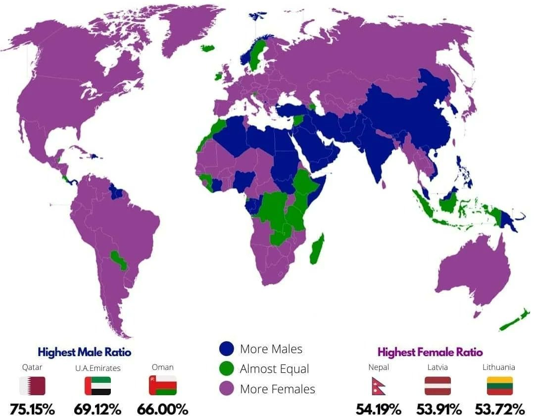
Map Enthusiasts@sopuli.xyzbyThe Picard Maneuver@lemmy.world2 yearsWorld map showing whether countries have more males or femaleslemmy.world 47184187
Honytawk@lemmy.zipEnglish2 yearsI’m guessing the pink ones are the countries that are the most at war with other countries. Or the blue ones are the ones that recently got out of war and are experiencing the Returning Soldier Effect -225%1
SybilVane@lemmy.ca2 yearsLife expectancy is longer for women, so I think it’s just countries with nothing weird going on, but they’ll still have significantly more older women than older men. 7

I’m guessing the pink ones are the countries that are the most at war with other countries.
Or the blue ones are the ones that recently got out of war and are experiencing the Returning Soldier Effect
Life expectancy is longer for women, so I think it’s just countries with nothing weird going on, but they’ll still have significantly more older women than older men.